Building a Map for a School I Was About to Leave
I turned two school floor plans into an offline indoor-navigation PWA with wall-aware, cross-floor A* routing.
Fremd Maps is an indoor map for Fremd High School. Pick a starting room and a destination, and it draws a route showing the fastest way between them. The building has two floors connected by multiple stairways, and the app handles both. Under the interface, it builds a wall-aware visibility graph in a Web Worker and uses A* to route between rooms.
The project is about a building I was about to leave. I know the stairs that are faster and the hallways that get crowded. New students don’t have that context, so I wanted to make something that could help someone find a room without asking another student or walking in circles.
This wasn’t the first version of the idea. During my junior year, I worked on a group project in Jetpack Compose for my mobile applications class. I handled the routing algorithm and most of the map display work. It only covered the second floor. I mostly wanted to know whether room-to-room routing could work at all. Thankfully for my grade, it worked out. I came back to this at the start of second semester senior year, rebuilt it as a web app, mapped both floors, and kept working on it through the summer after graduation.
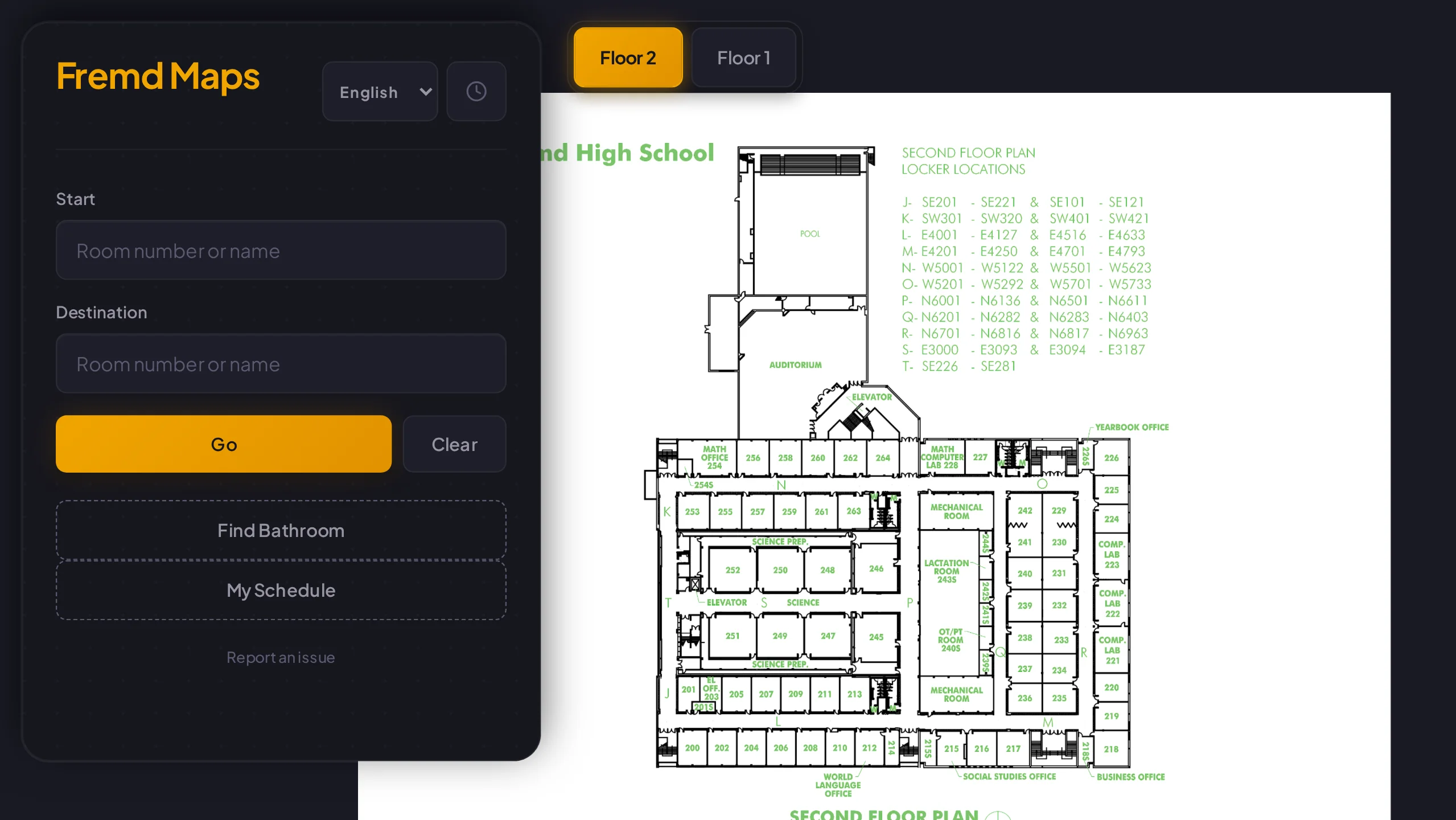
Data problem
I started with two floor-plan images. They show room names, walls, doors, and hallways, but they can’t tell code where someone can walk. They are architectural plans, not maps for students — lots of details that make sense for an architect but make the screen feel busy.
The original floor plans already have room labels, door markers, and hallway names that students recognize. I tried using wall data gathered through OCR to draw a cleaner version of the school. That gave me more control over the visuals, but stripping away the original context made the map harder to read, not easier. I would have had to rebuild room outlines, labels, doors, and a lot of smaller details by hand. I never found a simplified version that looked better and still explained the building as well as the original. In the end, I kept the floor-plan images and used the wall data for routing instead. The images help people understand where they are looking; the data tells the app where it can draw a route.
I had to add that data layer myself. Each floor has JSON files for nodes, walls, and traffic zones.
- Nodes represent rooms, hallway points, bathrooms, and stairways.
- Walls prevent routes from crossing through parts of the building.
- Traffic zones add cost to a route through a particular area.
Most of the node coordinates were placed by hand on top of the floor-plan image — a task not glamorous at all. A hallway that is obvious to a person can be surprisingly unclear in the data. One point in the wrong place can create a route through a room. One missing wall alleges that humans can walk through brick. As of writing, we don’t have that tech yet.
The data lives in the repository with the app. When a route looks wrong, I can check the point positions and wall segments that produced it. I also built development-only overlays that show nodes, walls, zones, and the graph on top of the floor plan — debugging from JSON alone was rather painful without them. The graph overlay is especially useful. When a route crosses an impossible spot, I can see whether a wall is missing, two nodes are too close, or a hallway point needs to move. I can also see the difference between a route that is valid in the graph and one that makes sense to a student using the app. The dev tools let me adjust positions while looking at the floor plan; those edits only last for the session. The real data stays in JSON files, where I can review changes before deployment. I don’t have a separate database or admin panel to search through.
Routing engine
I used Leaflet because it already handles panning, zooming, overlays, and the interaction patterns people expect from a map. It also supports non-geographic coordinates: lat is the vertical position on the floor-plan image and lng is the horizontal position.
I spent some time considering Leaflet tiles. Tiling makes sense for a large map because the browser only loads the pieces someone is looking at. I only have two floor-plan images. Nobody is going to pan far enough for tiles to be worth it. I used image overlays instead. Each floor is a single image with fixed bounds. That avoided a tile pipeline, tile seams, and extra deployment work. It also let me keep the original plans intact instead of committing to an incomplete redraw. I still got the pan and zoom behavior I wanted from Leaflet.
The app doesn’t route on the image itself. It builds a graph from the node and wall data. For each floor, it checks nearby nodes. When the straight line between two nodes doesn’t intersect a wall, it adds an edge. When a wall blocks the line, it doesn’t. Walls are good at that. That gives me a visibility graph, and A* finds routes through it.
At first, I thought about connecting each hallway point only to the next point I had entered. That would have been straightforward, but it would make the route depend too much on the order of the data. The visibility graph gives the pathfinder more choices in a long hallway and lets it skip points that don’t matter. A route that goes through a point because it was the only option in the data is a route that looks wrong to a person. Not ideal.
Since there are a lot of possible node pairs to test, I limit the maximum distance for an automatic connection, then check each possible edge against the wall data. Graph construction runs in a Web Worker so the map stays responsive. If the worker can’t run, the app falls back to the main thread. Some browsers don’t support Web Workers — they know who they are — so I made sure the algorithms perform well on the main thread too.
Stairways link the floors. A stair node on one image connects to its matching node on the other. I treat that as an edge with a cost, not a diagonal line between two floor plans. When a route reaches a stair node, the app pauses and asks the user to switch floors.
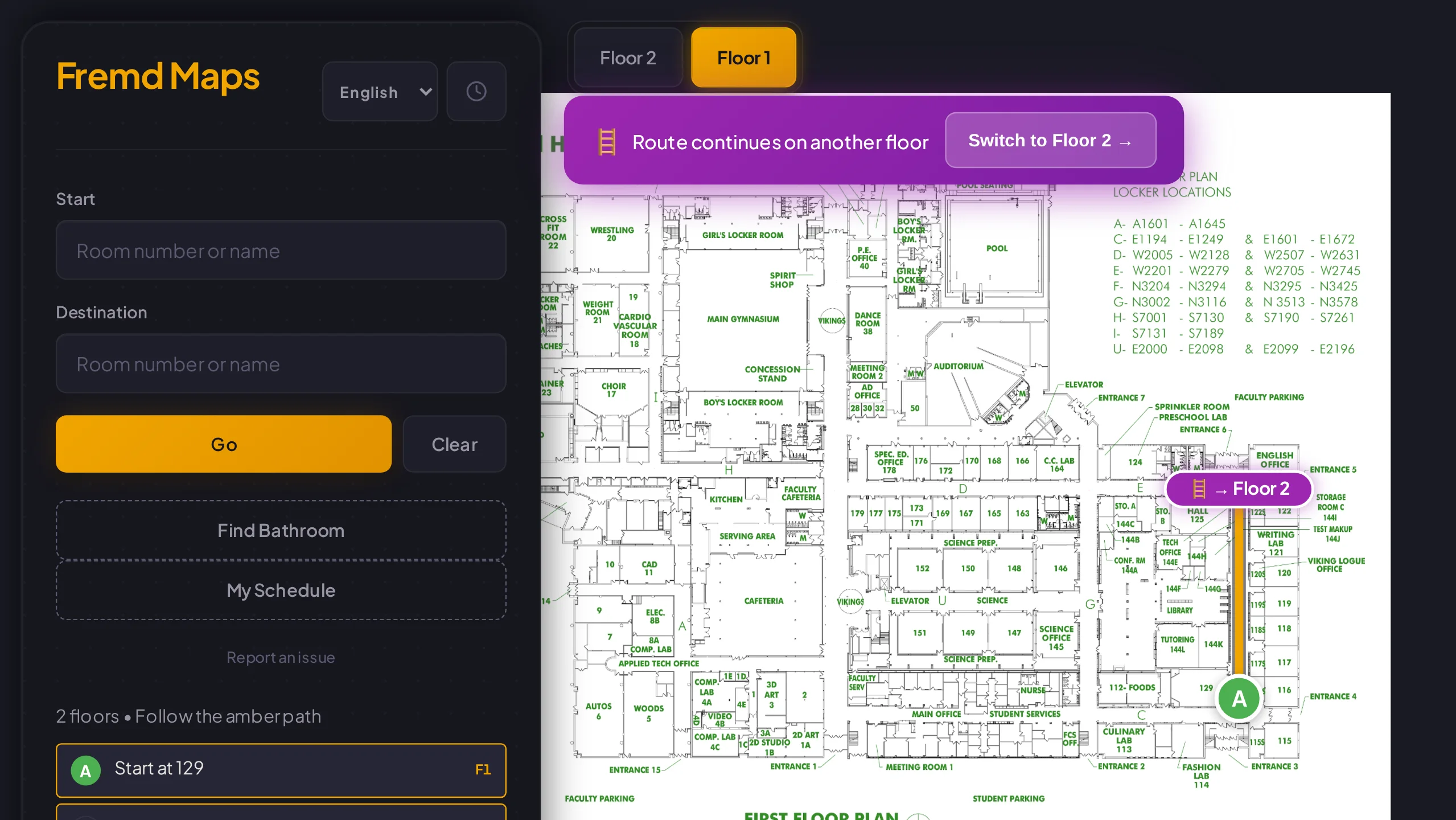
A cross-floor route pauses at the stairs and asks the user to switch floors.
The cost isn’t just distance: I add a small penalty to diagonal edges and a fixed penalty for stairs. Those values are weights tuned to produce sensible routes, not walking-time estimates. They keep the app from choosing paths that are short on paper but awkward in the building, like cutting diagonally across an open area instead of using the hallway. The hallway exists for a reason.
Interface
The first routes I generated were correct in a narrow sense — they reached the destination. They also included every small turn caused by a node in the graph, producing directions like “turn right, turn left, turn right, continue straight.” Nobody needs a GPS narrator having a small panic attack while trying to get to class.
Now I simplify the line and the written directions separately. Small bends disappear from the line, and the directions only display turns worth mentioning. This was when the project stopped feeling like an algorithm exercise and started feeling like an interface problem.
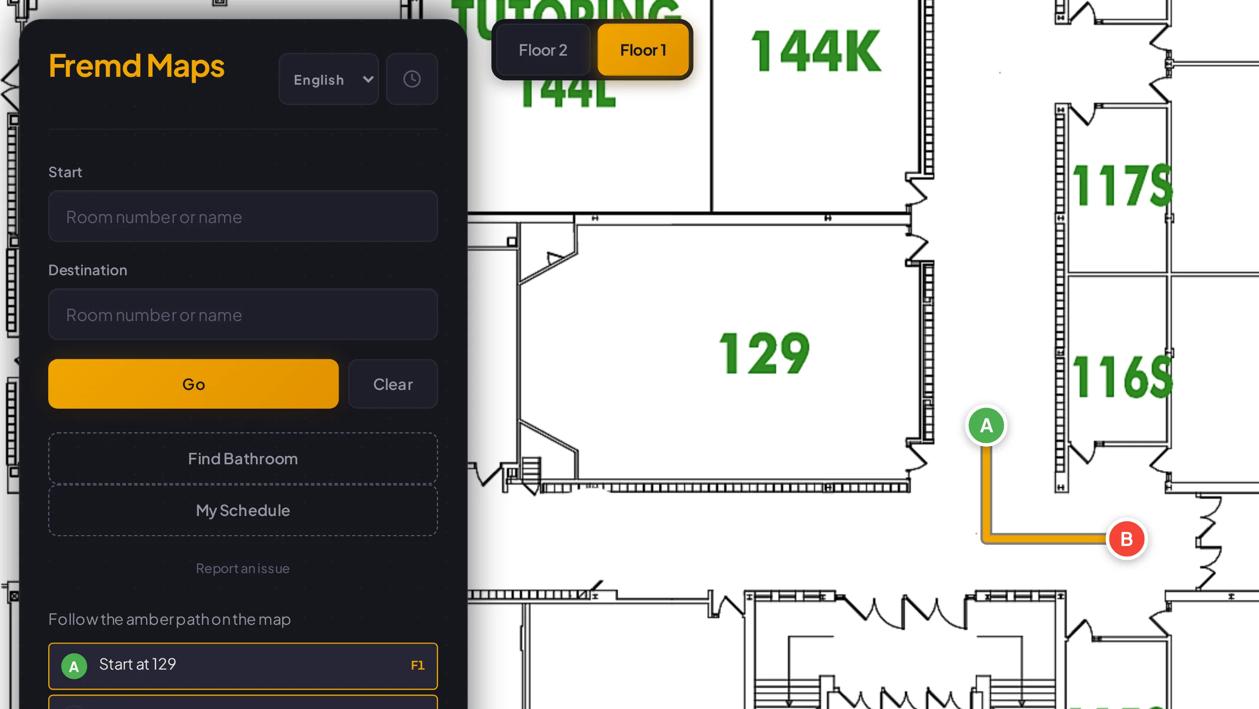
A same-floor route from room 129 to room 115, with the route and directions shown together.
Search is part of that interface too. Room names aren’t always what people type. The search uses fuzzy matching and aliases — biblioteca can find the Library. The displayed name still matches the sign in the building. There’s also a “Nearest bathroom” button that runs Dijkstra’s algorithm from the starting room and returns the closest option.
The phone layout got the most attention. On a phone, the route controls are in a bottom sheet with large buttons. On a wider screen, they become a sidebar. I didn’t want a desktop layout that simply shrinks until it’s unusable on a phone.
Architecture
I didn’t build a backend. The floor plans and navigation data are static assets, routing happens in the browser, and Cloudflare serves the site. Schools would be hesitant to run a backend and risk any kind of student data for a simple convenience tool. Understandable. This lightweight system makes it accessible for all students, no matter how old their mobile devices may be. If I had to fix a wall or add a node, I could update the data and deploy the site. The production app is backed by unit, end-to-end, accessibility, and navigation-data validation checks in CI.
The app is also a PWA. After the first load, it caches the app shell, floor plans, and navigation data. I wanted it to keep working when school Wi-Fi or mobile data is slow or unavailable. Users are prompted to refresh when a new version is detected. That also means I have to be careful with map updates — a changed hallway or room needs to reach people instead of leaving them with an old route. I treat map updates as carefully as code updates.
The biggest limitation is that Fremd Maps doesn’t know where a person is standing — the user has to pick a starting point. That works if they know the room they just left. It can’t help someone who is already lost. That is a harder problem. The map data is also manual, so a renovation or a locked door can make a route inaccurate without me knowing. The app doesn’t estimate travel time or offer accessibility-aware routes. I’d rather leave those out than give someone an answer I can’t stand behind.
Takeaways
This wasn’t the first version of the idea. During my junior year, I built an Android prototype in Jetpack Compose that only covered the second floor. I mostly wanted to know whether room-to-room routing could work at all. The Android prototype taught me that the basic idea was possible. Thankfully for my grade, it worked out.
I came back to it senior year with a better sense of what would actually be useful. The web version taught me where the real work was. A* was important, but it was only one piece. The harder parts were turning floor plans into data, checking routes against walls, handling stairs, writing usable directions, and testing the result against the building I knew.
I also got a clearer sense of how much regular map software hides. A line on a map looks simple, but it depends on choices about where someone can walk, what a connection means, and which route should be preferred. Working on one building made all of those choices visible.
Finishing this as a senior mattered to me. It gave the old class-project idea a second life and left me with something more complete than my original prototype. I won’t need this map in the same way anymore, but other students might. If it saves someone a few minutes or keeps a freshman from accidentally discovering the same hallway three times, that’s enough.
You can try it at maps.mananlalwani.com, or look through the code on GitHub.